Storybook: Design system in Frontend development
Style guidelines have been around for years, but not so long ago, designers and developers agreed to work together on an idea that is streamlining and facilitating the use of User Interfaces (UI) throughout the products of large companies.
When we create applications with React, Angular or Vue we can have thousands of components in our application and file structure. It can become chaos if our folders are not well organised and, even then, it is difficult to search for a certain component. That's why sharing components is more than recommended, as well as design systems and their consequence in software development: component libraries.
What is a design system?
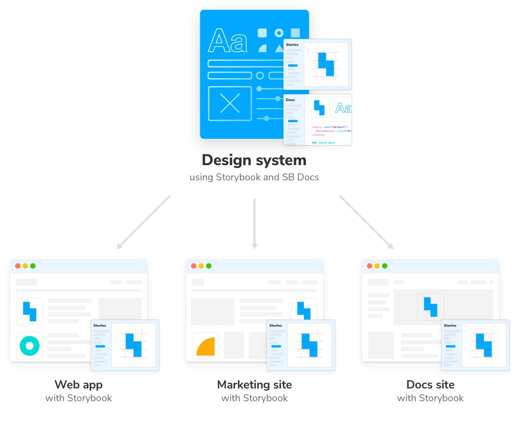
Modern user interfaces are built from hundreds of UI components that are endlessly reused to deliver different user flows. Design systems catalogue all reusable UI components, allowing teams to build complex and consistent interfaces across multiple projects more quickly.
It may also contain information on their use, how to build such interfaces or any information relevant to their implementation or installation.
The advantages of design systems over old practices are their scalability, consistency and robustness
The advantages of design systems over old practices are their scalability, consistency and robustness, which is why they have become the cornerstone of large companies and projects in their applications.
Reusability saves time and ensures a reliable user experience across all products, thus creating a homogenous and more easily maintainable environment.

With this situation and new paradigm, the need arose to have a tool that catalyses this knowledge between designers and developers, generates useful documentation for both and also facilitates the consumption of these components by the projects that want to use this design system. This is exactly why Storybook came to the rescue.
What is Storybook?
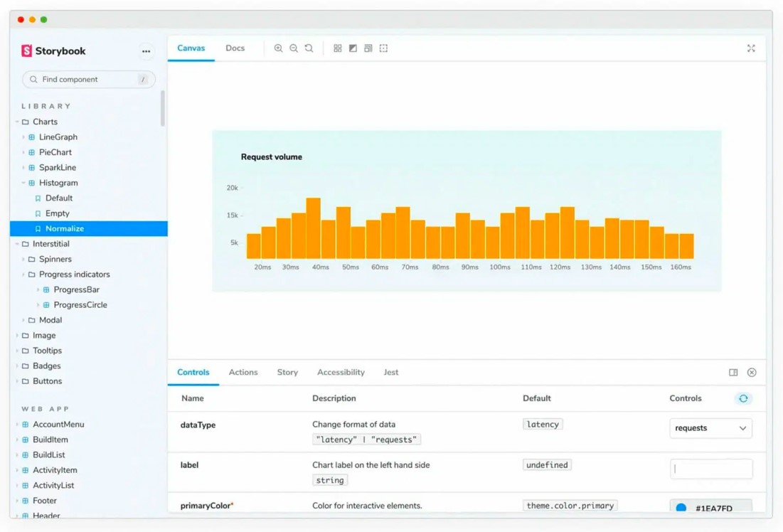
Storybook is an open source tool for building UI components and pages in isolation, generating documentation and enabling both development and testing of components. It allows you to visualise components in an organised and efficient way, interact with them dynamically and test them as if they were deployed in a real application.

You can also generate a static page with all the documentation related to these components, see the final result of the component or even the code to extract the component itself.
In addition, it has a large number of addons or extensions available, some of them included by default, which provide added information such as events emitted by the component or accessibility management. Customisation is modular and must be in accordance with the needs of the project.
Currently, it supports frameworks and libraries such as React, Angular, Vue, Web Components, Ember or Svelte, among others. It has become the standard for this type of projects due to its usefulness and power. We can see examples of complete component libraries, such as those of: Audi, Shopify Polaris, JetBrains or Carbon Components.
StoryBook reveals another way of working
In projects where we work in teams and where the volume of tasks is increasing, it is important to follow a very clear and defined order and structure. StoryBook allows us to work in this way, it is an orderly and collaborative tool, making it easy to reuse components.
It allows the workflow to be much more agile between the design team and the development team. By allowing to see the result, it is very easy and quick to identify and understand if it is what we need or if it is necessary to apply some improvement or correction. Large companies such as Dropbox, GitHub, Airbnb, Atlassian, Lyft, JetBrains and Microsoft rely on this tool to create their own projects. Shall we talk?

